Dave@lemmy.world to Mildly Interesting@lemmy.worldEnglish · 21 days agoModern Logos Redesigned in Retro 80s Stylewww.lightboxdisplays.co.ukexternal-linkmessage-square5linkfedilinkarrow-up171arrow-down14file-text
arrow-up167arrow-down1external-linkModern Logos Redesigned in Retro 80s Stylewww.lightboxdisplays.co.ukDave@lemmy.world to Mildly Interesting@lemmy.worldEnglish · 21 days agomessage-square5linkfedilinkfile-text
minus-squareQuarterSwede@lemmy.worldlinkfedilinkarrow-up4·20 days agoLove the glow look of a CRT. Too bad some of them don’t have the right font. Most are really good though. Googles is the most unrealistic, no one used smooth gradients like that back then.


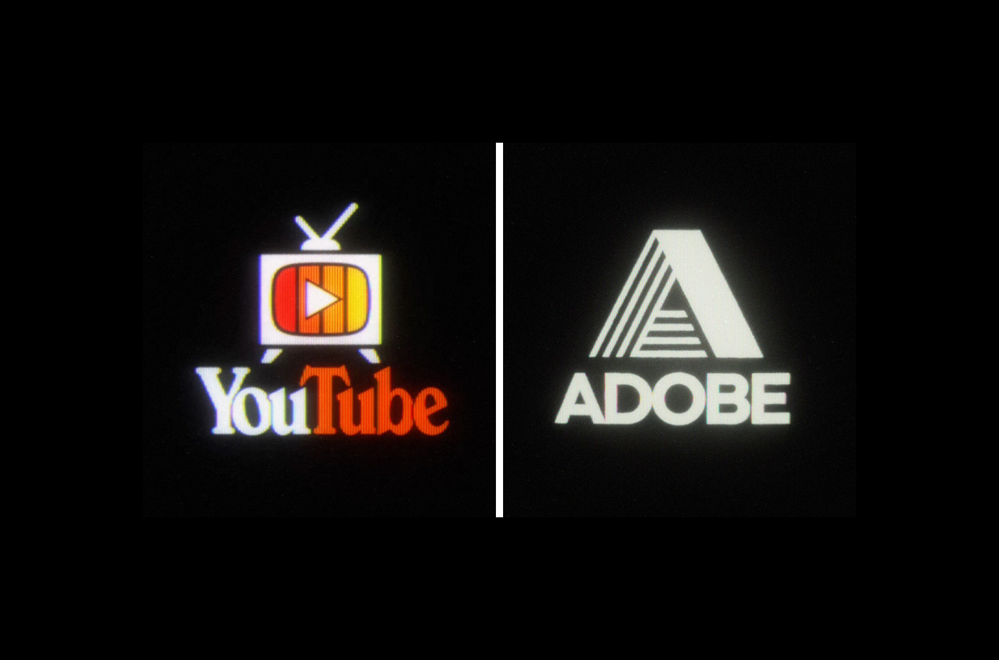
Love the glow look of a CRT. Too bad some of them don’t have the right font. Most are really good though. Googles is the most unrealistic, no one used smooth gradients like that back then.